
Design Process
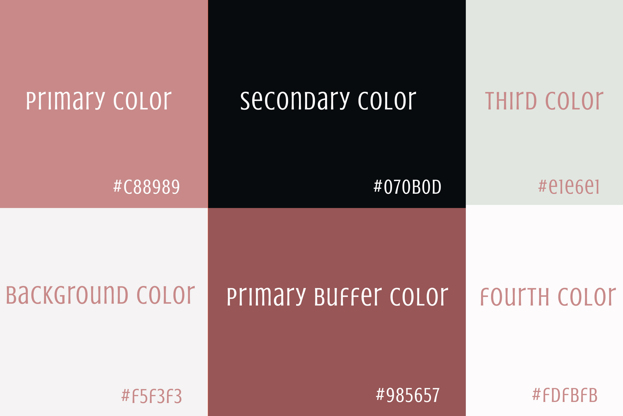
A way to focus on Nina Jones being a fashion brand aimed at women aged 18-35, I choose the color pink as the primary color to give the brand a feminine feel. Having black as the secondary color gave the brand a traditional base for the font color. Grey as the background color for the input fields stood out from the white and pink backgrounds. Choosing white as the background color gave the website a minimalistic look. The primary buffer color was used to draw attention to the buttons used on the website. For the second font color white was used mainly on the footer as a way for users to read the text easier.
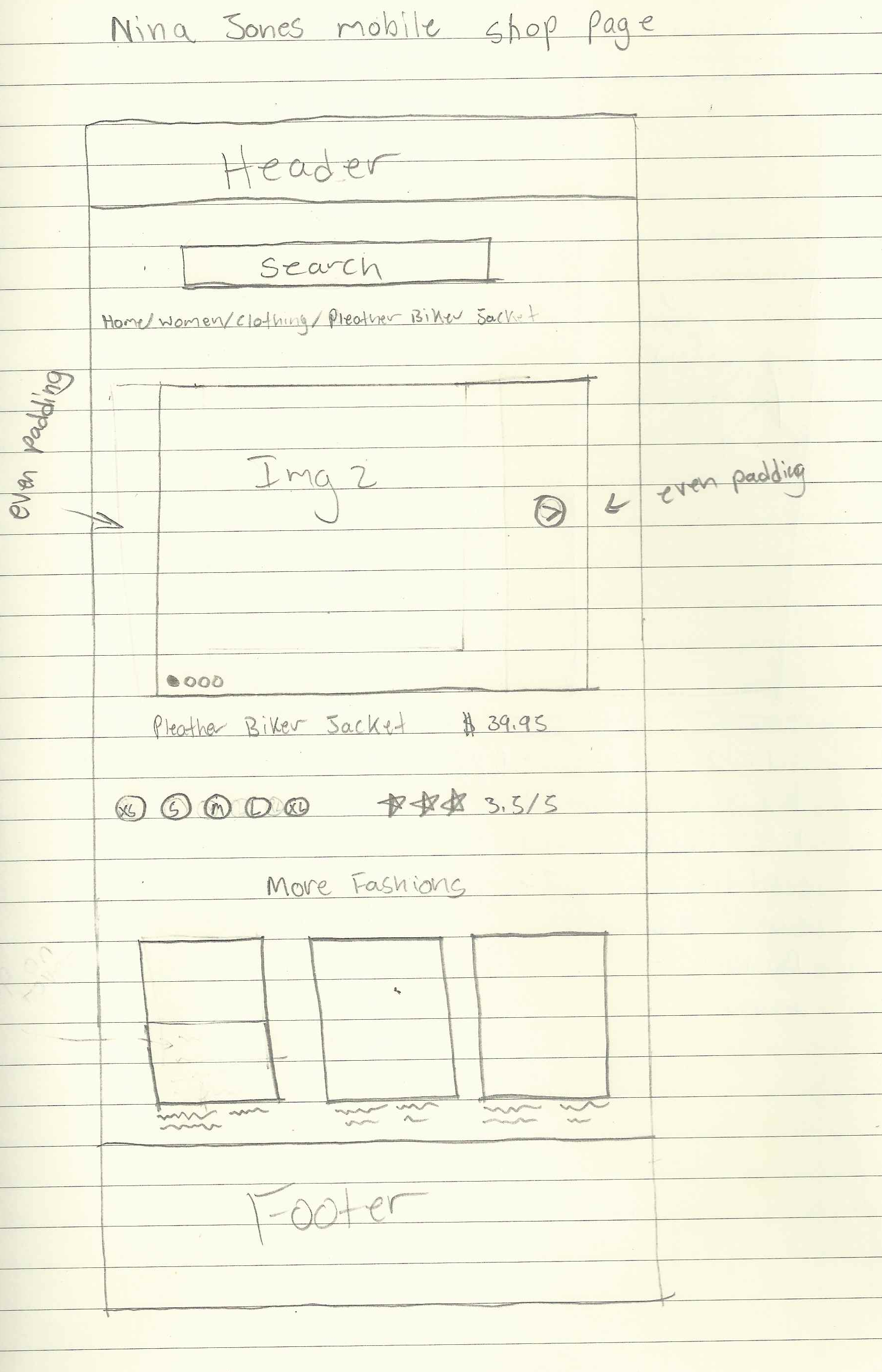
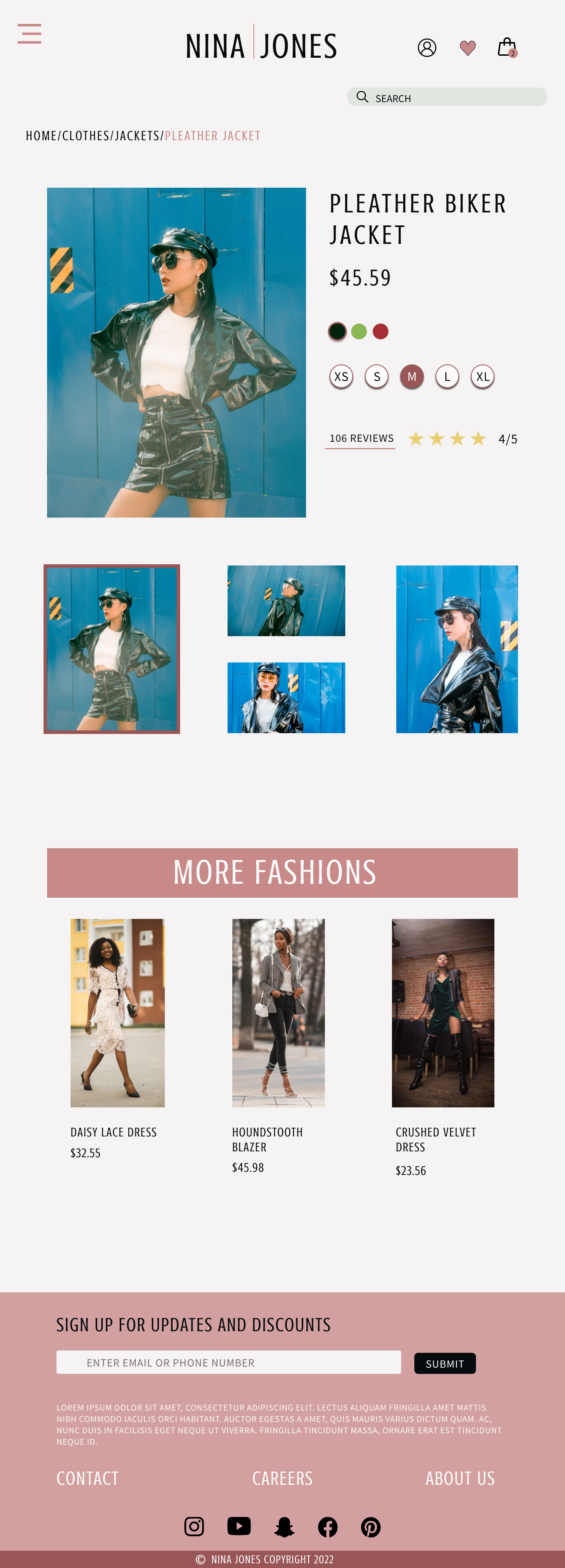
Nina Jones item selection drawn wireframe and Figma final wireframe for tablet
